At its core, data observability is about truly understanding the health of your data from end to end. It’s the difference between knowing if something broke and knowing why it broke, who it’s affecting, and exactly how to fix it. This approach lets your team catch and squash data issues long before they mess up a critical report, a dashboard, or a major business decision.
Understanding Data Observability Beyond the Buzzwords

Here’s a simple analogy. Think about the difference between the “check engine” light in an old car and the full diagnostic system in a new one.
Traditional data monitoring is that old “check engine” light. It gives you a single, vague warning: something’s wrong. A dashboard fails to load, a report errors out. You know there’s a problem, but you have zero context. This kicks off a frantic manual hunt through tangled pipelines—a painful process most data pros call “data firefighting.”
Data observability is the full diagnostic report. It doesn’t just flash a light; it gives you a complete, top-to-bottom view of your data ecosystem. It tells you which sensor failed, why it failed, how that’s affecting the engine’s performance, and what other systems might be in trouble as a result.
Let’s break down the key differences in a quick table.
Data Observability vs Traditional Data Monitoring
This table gives you a quick side-by-side comparison, highlighting just how different these two approaches really are.
| Aspect | Traditional Data Monitoring | Data Observability |
|---|---|---|
| Focus | Answers “Is the system up?” (Known unknowns) | Answers “Why is the system acting this way?” (Unknown unknowns) |
| Scope | Siloed; checks specific, pre-defined metrics (e.g., pipeline uptime) | Holistic; provides end-to-end visibility across the entire data stack |
| Approach | Reactive; alerts you after a failure has occurred | Proactive; detects anomalies and upstream issues before they impact users |
| Context | Limited; tells you what failed, but not why or how | Rich; provides deep context on root cause, lineage, and downstream impact |
| Goal | Maintain system uptime | Ensure data reliability, accuracy, and trust |
As you can see, observability goes much deeper, giving you the power to ask questions you didn’t even know you had.
From Reactive Fixes to Proactive Health
This shift—from putting out fires to preventing them—is where data observability really shines. Instead of waiting for a VP to notice the weekly revenue numbers look off, an observability platform alerts your team to the root cause an hour ago. Maybe an upstream API changed, or a dbt model failed to run.
By providing deep context, data observability helps prevent “data downtime”—those painful periods when your data is missing, wrong, or just plain unreliable. This is how you build real trust in data and make sure big decisions are based on solid ground.
This proactive stance isn’t just a nice-to-have anymore; it’s becoming essential. The global data observability market is expected to jump from around USD 1.7 billion in 2025 to a massive USD 9.7 billion by 2034. That kind of growth tells you something. If you want to dig deeper, you can explore the full market analysis to see what’s driving this trend.
So, what is data observability when you strip away the jargon? It’s the framework that gives data teams the ability to automatically answer the most important questions about their data pipelines:
- Detection: What went wrong?
- Root Cause: Why did it go wrong?
- Impact: Who and what is affected by this?
- Prevention: How do we stop this from ever happening again?
This is how modern teams manage data health with the same rigor DevOps teams have applied to software for years, making sure data is an asset everyone can rely on.
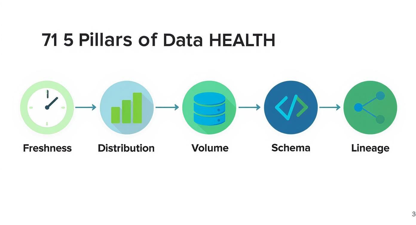
Getting to Know the 5 Pillars of Data Health
To really get a handle on the health of your data, you need more than just a green light saying a system is “on.” That’s table stakes. The real magic is in understanding the nuances of the data flowing through it. This is where the five pillars of data observability come in—they give you a practical framework for evaluating whether your data is truly reliable.
Think of these pillars as the vital signs for your entire data ecosystem. Each one tracks a specific aspect of data health. When you look at them together, you get a complete picture that helps you stop fighting fires and start preventing them in the first place.
Let’s break them down one by one.
1. Freshness
Freshness answers a dead-simple but mission-critical question: Is my data up-to-date? This pillar is all about timeliness, making sure the numbers hitting your stakeholders reflect what’s actually happening in the business right now. Stale data isn’t just useless; it can be dangerously misleading.
Imagine your RevOps team pulling a big sales performance report first thing Monday morning. If the data pipeline feeding it hasn’t updated since last Thursday, that report is completely missing all of Friday’s critical end-of-week deals. Decisions based on that report are guaranteed to be flawed. Freshness monitoring tells you the second a data source goes stale, so bad data never even makes it to an executive’s dashboard.
2. Distribution
Distribution is your gut check. It focuses on whether the values inside your data look right. It’s not about whether the pipeline ran, but whether the data itself makes logical sense. By looking at the statistical profile of a dataset, you can spot weird anomalies that signal a deeper problem.
For example, your company might normally see around 100 new sign-ups a day. If you wake up one morning and that number is zero, a distribution monitor will immediately flag it. The pipeline itself might be running perfectly, but this tells you something else is broken—maybe a sign-up form on the website crashed or a marketing automation workflow failed.
3. Volume
Volume is pretty straightforward: it tracks the completeness of your data by counting the number of records. A sudden spike or dip in volume is often the first and loudest signal that a data ingestion job has failed or, even worse, that records have been accidentally deleted.
Let’s say a key Salesforce table synced to Snowflake usually holds 500,000 contact records. If an overnight sync job messes up and only loads 50,000, a volume check will catch it and sound the alarm. This stops your analytics team from building reports on a dataset that’s 90% incomplete, which would throw off everything from customer counts to revenue forecasts.
These first three pillars—Freshness, Distribution, and Volume—are your frontline defense. They’re the most common signs of data downtime and give you immediate, high-signal alerts about what’s going on.
4. Schema
The schema is the blueprint of your data. It defines the columns, their data types (like text, number, or date), and how everything is organized in a table. An unexpected change to this blueprint, no matter how small, can create a massive ripple effect that shatters downstream dashboards and models.
A classic case is when an engineer changes a field name in a source system—say, from customer_email to customer_email_address. Seems harmless, right? Wrong. That one tiny change can cause every single dbt model and Looker dashboard that referenced the old field name to instantly fail. Schema monitoring catches these changes automatically, giving you a heads-up before anyone in the business even knows something is broken.
5. Lineage
Finally, lineage is the map that ties it all together. It traces your data’s entire journey, from its source (like a Salesforce object), through all the transformations (like dbt models), and all the way to its final destination (like a Tableau dashboard). When things go wrong, lineage is your secret weapon for finding the root cause—fast.
Without lineage, a funky-looking revenue report sends an analyst on a wild goose chase, manually digging through scripts and dependencies for hours. With automated lineage, they can instantly see exactly which upstream table broke, who owns it, and what other reports are impacted. This turns a multi-day investigation into a targeted, minutes-long fix.
For a deeper dive into how data actually moves between systems, check out our guide on what change data capture is and how it works—it’s a core concept for keeping data fresh across all your platforms.
Building a Practical Observability Architecture
Theory is one thing, but let’s get our hands dirty and build a real-world blueprint. To really grasp what data observability looks like in the wild, we need to see how it fits into a modern data stack. We’ll use a common Revenue Operations (RevOps) setup as our example, mapping how data gets from its source all the way to a business report, with observability as the guardian angel watching over every step.
The whole journey kicks off with your core operational systems. For most RevOps teams, that’s Salesforce. It’s the source of truth—where all your crucial customer, deal, and activity data is born.
Of course, that raw data needs to be moved somewhere central for analysis. That’s where a tool like Fivetran steps in. It uses a clever technique called Change Data Capture (CDC) to grab new and updated records from Salesforce and load them into a cloud data warehouse like Snowflake. This very first step is a classic failure point; if that sync breaks, every report and dashboard downstream is instantly running on stale data.
The Central Role of the Data Warehouse
Once the data lands in Snowflake, it’s still messy and raw, structured for an application, not for analysis. It’s not ready for prime time. This is where a transformation tool like dbt (data build tool) comes into play. Analysts and engineers write SQL models in dbt to clean, join, and reshape the raw Salesforce data into pristine, business-friendly tables—think monthly_recurring_revenue or sales_activity_funnel.
These are the clean tables that power executive dashboards in BI tools like Looker or Tableau. A VP of Sales isn’t digging through raw Salesforce tables; they’re looking at a Looker dashboard built on these curated dbt models. This entire flow—from source to ingestion, to warehouse, to transformation, and finally to BI—is your data pipeline.
So, where does data observability slot in? It’s not just another step in the pipeline. Instead, it’s an intelligent layer that stretches across the entire process, connecting all the dots.
An observability platform doesn’t move or transform your data. It simply connects to the metadata from each tool in your stack (Fivetran, Snowflake, dbt, Looker) to build a complete, end-to-end map of your data’s health and journey.
This constant, automated monitoring is what helps teams graduate from reactive firefighting to proactive health management. This infographic breaks down the core health checks—the five pillars—that an observability platform runs on your data at every single stage.
Think of each pillar as a different vital sign for your data. Together, they make sure nothing slips through the cracks as information flows through your systems.
Unlocking Pipeline Visibility with Lineage
Honestly, the single most powerful tool an observability platform gives you is automated data lineage. It works by scanning the query logs and metadata from all your connected tools to automatically map out every dependency, creating a visual family tree for your data. You can see exactly which Salesforce tables feed which Snowflake tables, which dbt models transform them, and which Looker dashboards ultimately rely on them.
What you get is a comprehensive, interactive map of your entire data ecosystem.
With this map, troubleshooting transforms from a multi-hour scavenger hunt into a precise, minutes-long fix.
Let’s walk through a classic “the-dashboard-is-wrong” fire drill to see this architecture in action:
- The Alert: An automated monitor goes off. The volume of the
opportunitytable from Salesforce suddenly dropped by 90% overnight. Something is very wrong. - The Investigation: Instead of manually digging through Fivetran logs, then Snowflake tables, then dbt run histories, an analyst just clicks the alert. The lineage view instantly points to the
opportunitytable as ground zero. - The Impact Analysis: But here’s the magic. That same lineage view also lights up every downstream asset that’s now broken. The analyst can see that 12 dbt models and 3 executive dashboards—including the main CRO revenue dashboard—are now contaminated with bad data.
- The Resolution: The team can immediately warn the specific people who own those dashboards while the data engineers focus on fixing the root cause in the Fivetran connector, without any wasted time.
This practical setup, powered by observability, gives data teams the full context they need to trust and manage their pipelines. It takes the abstract question of “what is data observability?” and turns it into a concrete solution for delivering reliable, high-quality data.
How to Implement Data Observability from Scratch

Diving into data observability can feel overwhelming, but you don’t need to boil the ocean. The secret is to start small and be strategic. Forget about monitoring every single table in your warehouse from day one. Instead, focus your energy where it will make the biggest difference for the business.
Your first move is to identify your most critical data assets. I’m talking about the handful of dashboards, reports, and dbt models that your company truly depends on. Ask yourself: What numbers does the CEO look at every morning? Which reports drive the weekly sales forecast or the marketing budget?
Make a list. These are your “crown jewels,” and your immediate priority is to ensure they are bulletproof. By starting here, you’re directly protecting high-stakes decisions, which is the fastest way to build trust and show value.
Prioritizing Your Data Assets
A great way to organize this is to think in tiers. Not all data carries the same weight, and a simple tiering system makes it crystal clear where to focus.
- Tier 1 (Mission-Critical): These are the assets that would cause a major fire drill if they broke or were just plain wrong. Think of the main executive revenue dashboard, lead-to-cash funnel reports, or the models that calculate sales commissions.
- Tier 2 (Business-Important): This stuff matters for running departments, but it might not be on the executive team’s daily radar. This could be campaign-level marketing analytics or sales rep activity reports.
- Tier 3 (Operational): These are the foundational tables and ad-hoc reports that analysts rely on. An issue here is still a problem, but it has a much smaller blast radius.
Begin by applying observability monitors exclusively to your Tier 1 assets. This laser-focused approach keeps you from getting bogged down and ensures you’re fixing the most painful problems first. This is becoming more important every day; the enterprise data observability software market is expected to explode from USD 1.5 billion in 2025 to USD 3.5 billion by 2035, all driven by this exact need for reliable data. You can dig into the numbers in this detailed industry report.
Creating Smart Monitors and Practical Runbooks
Once you know what to watch, the next step is to set up smart alerts that actually help. We’ve all been on teams that get spammed with so many notifications they just start ignoring them. The key is to avoid generic “something is wrong” pings. A good alert gives you context: what broke, where it broke, and who it’s affecting downstream.
The most crucial part of making alerts actionable is creating a runbook. A runbook is a simple, pre-defined set of instructions that tells your team exactly what to do when a specific alert fires. It turns a potential fire drill into a calm, methodical process.
What’s the plan when the main revenue table fails to update at 8 AM? A runbook lays it out. And if you want a hands-on guide to building the systems these runbooks monitor, our post on how to build a data pipeline from scratch is the perfect place to start.
Here’s what a simple runbook template looks like:
- Alert Name: Stale Revenue Data in
fct_monthly_revenue - Priority: P1 (Critical)
- On-Call Owner: Data Engineering Team Lead
- Immediate Steps:
- Post in the
#revops-alertsSlack channel, tagging key business stakeholders. - Pause all downstream dbt models that depend on this table.
- Check the Fivetran connector status for Salesforce.
- Post in the
- Escalation Protocol: If not resolved within 30 minutes, escalate to the Head of Data.
Closing the Loop with Business Stakeholders
Finally, remember that data observability isn’t just a tech tool—it’s a communication bridge. The end game is to build unwavering, organization-wide trust in your data. That can only happen with a tight feedback loop between your team and the business users.
When something goes wrong, use your platform’s lineage maps to show stakeholders exactly what’s going on. Tell them which reports are impacted and give them a realistic timeline for a fix. This kind of transparency turns a frustrating data mystery into a managed incident. It builds confidence and proves that the data team has its act together.
4. Measuring the Business Impact of Data Observability
So, you’re considering a data observability platform. It’s a real investment, and the big question from leadership is always the same: how do we know it’s worth it? The trick is to stop talking about technical specs and start connecting the dots to real business value.
By tracking a few key performance indicators (KPIs), you can paint a clear “before and after” picture. Before observability, how many hours did your team waste fighting data fires? After, how much faster and more reliable are your data pipelines? This contrast is where you’ll find your true return on investment (ROI).
From Technical Metrics to Business Outcomes
To make a real impact, you need to focus on metrics that resonate with the C-suite. They don’t just care about cleaner data; they care about saving money, making teams more productive, and driving smarter decisions.
Here are the core KPIs you need to get a handle on:
-
Time to Detection (TTD): This is all about how fast you spot a data quality problem. Without observability, this could be days or even weeks—and the alert usually comes from an angry executive who noticed a dashboard was wrong. A solid platform can shrink TTD from 48 hours down to under 15 minutes. That means you catch bad data before it poisons a critical report.
-
Time to Resolution (TTR): Once you know something’s broken, how long does it take to fix it? Without automated lineage, it’s a painful, manual scavenger hunt through queries and scripts. Data observability gives you a full map of your pipelines, which dramatically cuts down the investigation time and helps you get to a fix in a fraction of the time.
Tracking just these two metrics lets you put a real number on the time you’re saving, which leads right into the next crucial point.
Quantifying Engineering Hours and Reducing Downtime
The most straightforward way to calculate ROI is by looking at the time your highly-paid data team gets back. Every hour they’re not chasing down a broken pipeline is an hour they can spend on projects that actually grow the business.
Data incidents aren’t just technical glitches; they’re business interruptions. Every hour your team spends hunting for the source of bad data is an hour not spent optimizing the revenue funnel, improving customer analytics, or building a new data product.
Here are the last two KPIs you need to build an airtight business case:
-
Reduced Data Incidents: A great observability tool should give you a clear, downward trend in the number of data downtime incidents. Fewer fires mean more stable, trustworthy data for the entire company. Tracking this proves you’re improving the fundamental reliability of your data assets.
-
Engineering Hours Saved: This is where you connect time directly to money. Figure out how many hours your data team used to spend on manual firefighting each month. Multiply those saved hours by your team’s average hourly cost, and you’ve got a clear dollar amount that represents pure cost savings and productivity gains.
These four KPIs—TTD, TTR, incident reduction, and hours saved—tell a powerful story. They show that data observability isn’t just another expense. It’s a strategic investment that pays for itself by making your whole data operation more efficient, reliable, and valuable.
Key Performance Indicators for Data Observability ROI
Here’s a quick summary of the metrics you should be tracking to show the “before and after” impact of bringing in a data observability solution.
| KPI | What It Measures | Business Impact |
|---|---|---|
| Time to Detection (TTD) | The time elapsed between when a data issue occurs and when the team is alerted to it. | Prevents bad data from reaching decision-makers, protecting business strategy and operational integrity. |
| Time to Resolution (TTR) | The time it takes to fix a data issue after it has been detected. | Reduces data downtime and frees up engineering resources from lengthy investigations for value-added work. |
| Reduced Data Incidents | The decrease in the total number of data quality or pipeline failures over a given period. | Increases trust in data across the organization and provides more stable, reliable analytics for everyone. |
| Engineering Hours Saved | The amount of time the data team saves by not having to manually detect and resolve issues. | Translates directly into cost savings and allows the team to focus on innovation and revenue-generating projects. |
Tracking these metrics gives you a concrete way to prove that your investment is delivering real, measurable value back to the business.
Finding the Right Data Observability Tools
Navigating the market for data observability tools can feel like a maze, but it really just boils down to finding what fits your team’s needs, budget, and tech stack. The whole landscape can be sorted into three main buckets, each built for a different kind of team.
First up, you have the end-to-end platforms. Think of managed, software-as-a-service (SaaS) solutions like Monte Carlo or Metaplane. These are designed to be a complete, automated system right out of the box. They plug into your entire data stack—from ingestion to the warehouse to your BI tools—and give you automated monitoring and alerting with very little setup. This is usually the best bet for teams that need to see value fast and don’t want to get bogged down building their own system.
Balancing Control and Convenience
Next, there are the open-source solutions. Tools like OpenMetadata offer incredibly powerful features, especially for things like data lineage and cataloging. This route gives you maximum control and lets you customize everything, making it a great option for companies with strong engineering teams who want to build a truly bespoke observability practice. The trade-off? It comes with significant overhead for setup, maintenance, and scaling everything as you grow.
Finally, you have warehouse-native features. Platforms like Snowflake are starting to build basic monitoring capabilities directly into their products. These can give you a decent starting point with simple checks on query performance, cost, and usage. While they’re useful for teams just dipping their toes into data quality, they don’t offer the deep, end-to-end visibility across your entire stack that a dedicated platform does.
The goal isn’t to pick a single “winner.” It’s all about understanding the trade-offs. The right choice comes from an honest look at your team’s priorities: do you need a fast, managed solution, or do you have the engineering muscle to build and customize an open-source tool?
Choosing the right tool is a huge step in making your data quality strategy a reality. To help you weigh your options, our guide on the top data pipeline monitoring tools dives deeper into the different solutions on the market. It’ll give you the context you need to make a smart decision that truly fits your team’s goals.
Frequently Asked Questions
When teams first start digging into data observability, a few questions always seem to come up. Let’s tackle them head-on to clear up any confusion and get you on the right track.
What Is the Main Goal of Data Observability?
At its core, the main goal is to slash data downtime to zero. That’s any period when your data is missing, inaccurate, or just plain untrustworthy.
Data observability gives your team the power to catch and fix data quality problems as they happen, not days or weeks later. It’s all about building a deep, unshakable trust in your data across the entire company, so every business decision is built on a solid foundation.
How Is Data Observability Different from Data Governance?
This is a great question. The easiest way to think about it is that data governance sets the rules of the road, while data observability acts as the traffic cop making sure everyone follows them.
Data governance is the framework defining who can do what with which data, and when. Data observability is the active process of making sure the data moving through that framework is healthy and reliable.
For instance, your governance policy might state that a customer’s email address can never be empty. An observability platform would then keep an eye on that specific field, automatically flagging any null values and alerting the team the moment a problem pops up. They’re two sides of the same coin, working together to make data both secure and sound.
Is Data Observability Just for Data Engineers?
Absolutely not. While data engineers are often the first ones to get their hands on these tools to troubleshoot broken pipelines, the real magic happens when the benefits ripple out to everyone.
- Data Analysts can finally stop second-guessing their dashboards and trust the numbers they’re presenting.
- Analytics Engineers get a clear picture of how changes to their dbt models will impact everything downstream.
- RevOps Leaders and other business stakeholders can confidently make decisions knowing their reports are accurate and fresh.
It’s a tool that builds a much-needed bridge between the technical folks and the business users who depend on the data.
Does Implementing Data Observability Require a Lot of Manual Setup?
This is a common myth, usually stemming from experiences with older data testing methods. The old way involved engineers manually writing and maintaining hundreds of specific, brittle tests. It was a huge time sink.
Modern data observability platforms flip that script. They lean on machine learning to automatically learn your data’s unique heartbeat—its normal freshness, volume, and distribution. You get alerts only when something actually deviates from the norm. This automated approach gives you broad coverage almost instantly, without a massive upfront engineering effort. You can spend your time fixing problems, not just looking for them.
Tired of firefighting data issues in your RevOps stack? RevOps JET provides on-demand data engineering to build the reliable, observable pipelines you need. Stop guessing and start trusting your data.