A customer success KPI is simply a number that tells you how well you’re helping customers get what they paid for. These metrics are your lifeline for understanding customer health, spotting churn risks before they become problems, and finding opportunities to grow. The big three you’ll always hear about are Net Revenue Retention (NRR), Churn Rate, and the Customer Health Score.
Before we dive deep into the formulas and SQL, let’s get a bird’s-eye view of the core metrics we’ll be covering. This table is your quick reference guide to what each KPI measures and why it matters to the business.
Quick Overview of Core Customer Success KPIs
| KPI (Key Performance Indicator) | What It Measures | Primary Business Goal |
|---|---|---|
| Churn Rate | The percentage of customers or revenue lost over a period. | Minimize customer and revenue loss. |
| Net Revenue Retention (NRR) | The percentage of recurring revenue retained from existing customers. | Maximize revenue from the existing customer base. |
| Expansion MRR | The additional monthly recurring revenue from existing customers. | Drive growth through upsells and cross-sells. |
| Customer Health Score | A predictive score indicating the likelihood of a customer to churn or grow. | Proactively identify and address at-risk customers. |
| Time to First Value (TTFV) | How long it takes a new customer to realize value from your product. | Accelerate customer onboarding and adoption. |
Think of these as the vital signs for your customer base. Each one tells a different part of the story, and together, they paint a complete picture of your company’s health.
Why Customer Success KPIs Are Your Business Compass

Trying to run a subscription business without data is like driving a car with a blacked-out dashboard. Sure, you’re moving, but you have no clue how fast you’re going, if you’re about to run out of gas, or if smoke is about to pour out from under the hood. Your customer success KPIs are that dashboard—they give you the critical signals you need to navigate the entire customer journey.
These numbers aren’t just ‘nice-to-have’ anymore; they’re essential for survival and growth. They tell the real story of customer loyalty, satisfaction, and the health of your future revenue. By tracking the right metrics, you stop putting out fires and start preventing them, solving issues long before a customer even thinks about leaving.
Leading Versus Lagging Indicators
To get a true read on your business, you need to know the difference between two types of metrics:
- Lagging Indicators: These tell you what already happened. Think of them as the final score of a game. Churn Rate and Net Revenue Retention (NRR) are perfect examples—they measure past results. They’re absolutely critical for grading your performance, but you can’t go back in time to change them.
- Leading Indicators: These are your crystal ball. They’re the forward-looking metrics that give you a hint of what’s to come, like shots on goal or time of possession in a soccer match. A Customer Health Score or Time to First Value (TTFV) acts as an early warning system, giving you a chance to step in and influence the final outcome for the better.
A business that only tracks lagging indicators is always looking in the rearview mirror. To steer effectively, you must balance your view of the past with a clear focus on the road ahead, which is precisely what leading indicators provide.
This is exactly why companies are investing so heavily in this space. The global customer success platform market is on track to hit $3.1 billion by 2026, all because businesses need tools that can pull this data together for real-time tracking. It’s no surprise that 55.2% of Customer Success Managers say their focus is shifting toward more data analytics to sharpen how they measure these KPIs. If you’re curious, you can find more insights from customer success statistics.
Measuring Revenue Health and Customer Loyalty

While forward-looking metrics give you a peek into the future, lagging indicators tell the undeniable truth about what’s already happened. These are the numbers that show up on executive dashboards and in board decks because they tie directly to the financial health of the business. They measure the final outcome—the tangible result of all your team’s hard work.
Think of them as the final score of the game. They don’t explain how you won, but they confirm that you did. For a customer success team, the most crucial lagging indicators all circle back to revenue and loyalty, proving your direct impact on the bottom line. Let’s dig into the essential KPIs that tell this story.
The Two Sides of Customer Churn
Churn is the boogeyman of every subscription business. It’s the customers and the revenue that slip through your fingers over a given period. But not all churn tells the same story, which is why you have to track two distinct types.
- Logo Churn (Customer Churn): This is just a straight-up count—the percentage of customers who canceled their subscriptions.
- Revenue Churn: This tracks the percentage of monthly recurring revenue (MRR) lost from those same cancellations.
Why bother with both? Imagine you lose 10 small startups but hold onto one massive enterprise client. Your logo churn might look terrible, but your revenue churn could be just fine. On the flip side, losing that single enterprise client would be devastating for your revenue churn, even if your logo churn is a mere 1%. Tracking both paints a complete picture of who is leaving and how much it hurts.
The ultimate goal isn’t just to keep churn low. The real holy grail for SaaS is achieving negative churn, which happens when the revenue you gain from existing customers (through upgrades and expansions) is greater than the revenue you lose from cancellations.
Decoding Expansion MRR
Expansion Monthly Recurring Revenue (MRR) is the secret sauce for efficient growth. It’s all the new revenue you generate from the customers you already have. This is the “good” revenue that fights back against churn and fuels growth without the high price tag of acquiring brand-new customers.
Expansion MRR typically comes from a few key actions:
- Upsells: A customer moves to a more expensive plan, like from a “Pro” to an “Enterprise” tier.
- Cross-sells: A customer buys another product or adds on a new service.
- Seat Additions: A customer adds more users or licenses to their current subscription.
For example, if a client on a $500/month plan adds five more users for an extra $100/month, that $100 is pure Expansion MRR. When you see this number growing, it’s proof that customers are finding so much value in your product that they’re doubling down on their investment. It’s a powerful signal of both product-market fit and a customer success team that’s firing on all cylinders.
Net Revenue Retention (NRR): The Ultimate Metric
If you were forced to pick just one KPI to live or die by, Net Revenue Retention (NRR) would be it. Sometimes called Net Dollar Retention (NDR), this metric shows your ability to not just keep but grow the revenue from your existing customers. It’s the most complete measure of customer health because it bundles everything together: upgrades, downgrades, and churn.
Here’s the formula:
NRR = (Starting MRR + Expansion MRR - Downgrade MRR - Churned MRR) / Starting MRR
Let’s walk through a quick example. Say you start the month with $100,000 in MRR. Over that month:
- You gain $10,000 in Expansion MRR from upsells.
- You lose $2,000 from customers downgrading their plans.
- You lose $5,000 from customers who churned out completely.
Your NRR would be: ($100,000 + $10,000 - $2,000 - $5,000) / $100,000 = 1.03, which translates to an NRR of 103%.
An NRR over 100% means your business is growing even if you don’t sign a single new customer. This is exactly why investors and executives are obsessed with it. Studies consistently show that companies with an NRR above 120% dramatically outperform their competitors in market value because their growth engine is sustainable and not entirely dependent on expensive new customer acquisition.
A high NRR proves your product has serious staying power. Customers aren’t just sticking around; they’re deepening their partnership with you, which is directly linked to a higher Customer Lifetime Value (LTV). If you want to dive deeper into this relationship, check out our guide on calculating Lifetime Value in SaaS. These revenue-focused KPIs are the language of the C-suite, and mastering them is how you build a rock-solid business case for your team’s value.
Building Your Early Warning System
While revenue metrics tell you what happened last quarter, they’re like looking in the rearview mirror. They don’t tell you what’s coming up ahead. To truly get ahead of the curve, you need to shift from reacting to problems to predicting them. That means building an early warning system based on leading indicators—the proactive KPIs that whisper what the future holds.
Think of these metrics as a weather forecast for your customer base. They give you a chance to grab an umbrella before the downpour starts. Instead of being blindsided by a cancellation email, you can spot the warning signs weeks or even months in advance.
Two of the most powerful predictive KPIs you can track are the Customer Health Score and Time to First Value. Let’s break them down.
Decoding the Customer Health Score
A Customer Health Score is a single, blended metric that predicts a customer’s likelihood to grow, renew, or churn. It’s not some universal formula you can just copy and paste from a blog post. A truly effective health score is custom-built to reflect what a “healthy” customer actually looks like for your specific product.
I like to think of it as a credit score for your customers. A high score signals a low-risk, high-potential relationship. But a dropping score? That’s a huge red flag that needs immediate attention from your team. Building a solid health score means pulling together data from a few different places to create one, simple, actionable number.
A well-rounded health score typically pulls from three key areas:
- Product Usage: How are they really using your tool? You’ll want to track things like daily active users, which features they’ve adopted, and how long they’re staying logged in.
- Support & Engagement: What’s their relationship with your team like? This bucket includes things like the number of support tickets they’ve filed, whether they show up for webinars, or if they engage with your content.
- Sentiment & Feedback: How do they feel about you? This is where you pull in data from Net Promoter Score (NPS) surveys, Customer Satisfaction (CSAT) scores, and the qualitative feedback your CSMs are gathering in conversations.
The best Customer Health Scores are always weighted. Not all signals are created equal. A customer who hasn’t logged in for 30 days is a much louder churn alarm than one who submitted a low-priority support ticket last week.
Monitoring health scores is fundamental for forecasting retention and flagging at-risk accounts. In fact, companies that combine these scores with AI analytics have seen over 50% improvements in their churn prediction accuracy. And considering 72% of customers expect immediate, personalized service, these scores are becoming non-negotiable. You can read more about the impact of these customer success metrics.
Measuring Time to First Value
First impressions are everything, especially in the world of SaaS. Time to First Value (TTFV) measures exactly how long it takes a new customer to hit that first “Aha!” moment—the point where they truly experience the value your product promised them. A short TTFV is one of the strongest predictors of long-term retention.
Think about it. If you sell project management software, “first value” isn’t when a customer creates an account. It might be when they successfully complete their first project, invite three team members, or finally integrate their calendar. The trick is to define this milestone from your customer’s point of view, not your own.
Once you’ve nailed down what that value event is, the formula is simple:
TTFV = Date/Time of Value Achievement - Date/Time of Sign-up
A slow TTFV is almost always a sign of friction in your onboarding. Are your tutorials confusing? Is the UI clunky? Is the setup process a pain? Tracking and shrinking this metric forces you to create a smoother, faster path to success for every new user. This doesn’t just cut down on early-stage churn; it builds positive momentum that leads to happy customers who stick around and grow.
These leading indicators are the backbone of any proactive customer success strategy. By focusing on health scores and TTFV, you can build a system that doesn’t just monitor customer outcomes but actively improves them. It’s how your team moves from constantly fighting fires to making strategic, data-driven moves—which is essential for accurately predicting customer churn before it ever happens.
Connecting Your Data to Calculate KPIs
Knowing the formulas for your customer success KPIs is the easy part. The real work begins when you have to wire everything up and bring those formulas to life with your own data. This is where theory meets reality—that hands-on, often messy process of connecting different data sources to build a single source of truth for your metrics.
To calculate something meaningful like NRR or a Customer Health Score, you can’t just look in one place. The data you need is almost always scattered across your CRM, billing platform, product analytics tools, and even your support desk. The first step is to figure out exactly where each piece of the puzzle lives.
Mapping Your Data Sources
Think of it like getting all your ingredients ready before you start cooking. You can’t bake a cake if the flour is in one building and the eggs are in another. You need a solid plan to bring everything to the kitchen, and the same goes for your KPIs.
To get you started, here’s a practical look at where you’ll typically find the data needed for the core customer success metrics.
Data Source Mapping for Core Customer Success KPIs
| KPI | Primary Data Source(s) | Example Data Points |
|---|---|---|
| Churn & NRR | Billing Platform (Stripe, Zuora), CRM (Salesforce) | Subscription start/end dates, MRR per account, plan changes, cancellation reasons. |
| Expansion MRR | Billing Platform, CRM | Upgrade/downgrade events, add-on purchases, new contract values. |
| Customer Health Score | Product Analytics (Amplitude), CRM, Support Desk (Zendesk) | Daily active users, feature adoption rates, support ticket volume, NPS scores. |
| Time to First Value | Product Analytics | Timestamps of key “value” events, user sign-up dates. |
Getting this mapping right is the foundation for everything else. Without this clarity, your calculations will be built on shaky ground. It’s also a perfect opportunity to spot gaps in your customer data. For a deeper look at leveling up your data quality, see how B2B data enrichment strategies can fill in those crucial missing details in your CRM.
Building Your Data Models
Once you know where your data lives, the next job is to transform all that raw information into clean, reliable models. If you have a data team, they’re likely doing this with SQL or a tool like dbt (Data Build Tool), which lets them build and test data transformations in a controlled, repeatable way.
Let’s take a simple example. To calculate changes in Monthly Recurring Revenue (MRR), you need to combine data from your subscriptions table (from your billing system) and your customers table (from your CRM).
Here’s a simplified SQL snippet showing how you might start to model this for a single customer:
WITH monthly_mrr AS ( SELECT customer_id, date_trunc(‘month’, subscription_date) as mrr_month, SUM(mrr) as total_mrr FROM subscriptions GROUP BY 1, 2 )
SELECT customer_id, mrr_month, total_mrr, — Use a window function to get the previous month’s MRR LAG(total_mrr, 1, 0) OVER (PARTITION BY customer_id ORDER BY mrr_month) as previous_mrr, — Calculate the change total_mrr - LAG(total_mrr, 1, 0) OVER (PARTITION BY customer_id ORDER BY mrr_month) as mrr_change FROM monthly_mrr
This query gives you a clean table showing how each customer’s MRR changes month-over-month. This is the fundamental building block you’ll need to accurately calculate both NRR and Expansion MRR.
A Practical Playbook for Health Scores
Building a customer health score is the perfect example of blending different data streams. You’re essentially grabbing a bunch of different signals, deciding how important each one is, and boiling it all down to a single, actionable number.
This flow shows how it works in practice, moving from raw data to a score that your team can actually use.
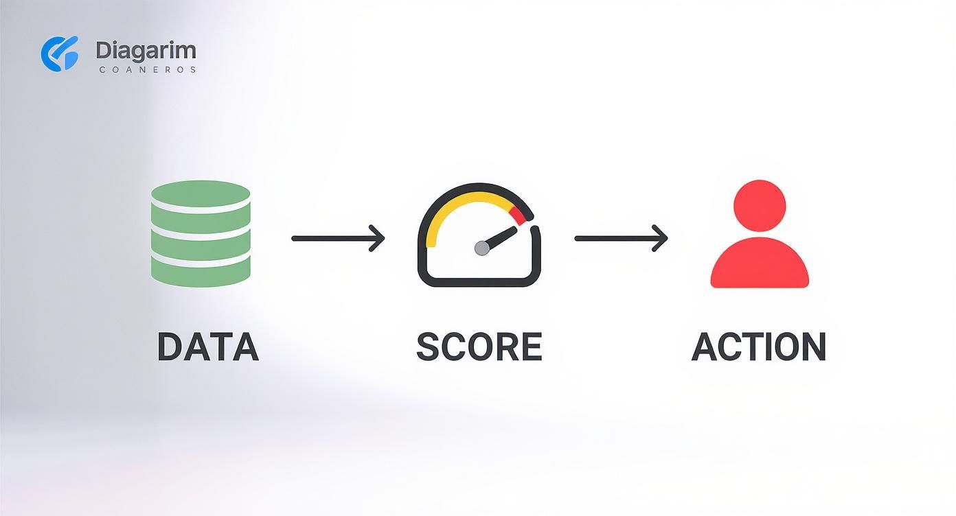
As you can see, you start by pulling in raw data, run it through your model to generate a score, and then use that score to trigger an action—like having a CSM reach out to a struggling customer.
The Big Takeaway: A health score isn’t a one-and-done metric. It’s a dynamic data product. It needs a solid data pipeline behind it to constantly pull in fresh information, recalculate scores, and push those updates back into the tools your team uses every day.
Setting up this data foundation is a technical job, but the payoff is huge. It gives your customer success team a reliable, automated system that turns abstract KPIs into concrete numbers. This empowers them to guide their daily priorities and strategic decisions with confidence, knowing every move is backed by solid data.
Turning Metrics Into Meaningful Action

Calculating a KPI is a great technical win, but it’s completely useless until someone actually uses it to make a better decision. Raw numbers are just noise. The final, most crucial step is turning your carefully crafted metrics into a clear signal that drives intelligent action across the business. This is where you graduate from just measuring success to actively creating it.
The whole point is to operationalize your data, weaving it into the daily fabric of your team’s workflow. Think of it like a ship’s navigation system. The data team builds the GPS, but it’s the captain and crew who use the real-time maps and alerts to actually steer the ship, dodge icebergs, and get where they’re going faster.
Designing Dashboards That Tell a Story
A great dashboard isn’t just a collection of charts; it’s a visual story that should answer your most important questions at a glance. But here’s the thing: one size never fits all. To make your dashboards work, you have to tailor the view to the person looking at it.
-
For the Execs: Keep it high-level. They need to see the big picture, focusing on lagging indicators that reflect overall business health. Think Net Revenue Retention (NRR), total Expansion MRR, and Customer Churn trends over the last few quarters. The goal is a quick, strategic gut-check, not a deep analytical dive.
-
For the CSMs: This is the tactical command center. It needs to be all about leading indicators—things like Customer Health Scores, product adoption rates, and upcoming renewal dates. The focus is purely on action. Which accounts need my attention right now?
The mark of a great dashboard isn’t how much information it contains, but how quickly it leads to a correct conclusion. If a CSM can’t look at their dashboard and immediately identify their top three priorities for the day, it has failed.
Setting Up Proactive Alerts
Dashboards are perfect for getting the lay of the land, but some events demand immediate attention. This is where automated alerts become your team’s superpower. Instead of waiting for a CSM to spot a problem during a weekly review, you can get a real-time ping about critical events as they happen.
Just imagine an alert that sends a Slack message to a CSM the moment one of their key accounts has a 20-point drop in its health score. That single alert transforms the team from reactive firefighters into proactive advisors who can jump in before a small issue snowballs into a churn risk.
A few must-have alerts to set up:
- Significant drops in product usage
- A key champion or user suddenly goes inactive
- An unexpected spike in support tickets
- A low NPS score from a high-value account
Avoiding Common Implementation Pitfalls
As you bring your customer success KPI program to life, watch out for a few common traps that can completely derail your hard work.
-
Chasing Vanity Metrics: It’s easy to get fixated on numbers that look good but mean nothing for customer value or your bottom line. High login counts are great, but they’re useless if users aren’t adopting the sticky features that solve their core problems.
-
Forgetting Cross-Functional Buy-In: Customer success doesn’t operate in a silo. You have to share your dashboards and insights with Product, Marketing, and Sales. When the product team sees that users who adopt Feature X have a 30% higher health score, it directly informs their roadmap and makes everyone’s job easier.
-
Letting Perfect Be the Enemy of Good: Don’t wait months to launch a “perfect” health score. Start with a simple, directionally correct version 1.0. Get it into the hands of your team, learn from how they use it, and iterate. The goal is continuous improvement, not instant perfection.
By building tailored dashboards, setting up smart alerts, and steering clear of these pitfalls, you can create a truly data-driven culture. This ensures your customer success KPIs aren’t just numbers on a screen, but the very heartbeat of a customer-centric organization.
Got Questions About Customer Success KPIs? We’ve Got Answers.
Putting these customer success metrics into practice is where the rubber meets the road, and it’s totally normal for questions to pop up. Moving from theory to real-world application is the key to making smarter, data-backed decisions. Let’s tackle some of the most common questions we hear.
How Often Should We Actually Look at These KPIs?
The right answer really depends on the metric. It’s helpful to think in terms of leading versus lagging indicators.
- Leading Indicators: Things like product usage data and Customer Health Scores are your early warning system. These should be on a daily, if not real-time, monitor. This is what lets your team be proactive and jump on a potential issue before it becomes a real problem.
- Lagging Indicators: Financial metrics like NRR and churn are better suited for monthly and quarterly reviews. They’re less about a single customer’s immediate health and more about spotting bigger-picture trends to shape your strategy.
A good rhythm we see with successful teams is daily checks for frontline CSMs, weekly roll-ups for managers, and monthly/quarterly summaries for the leadership team.
What’s the Real Difference Between Logo Churn and Revenue Churn?
This is a fantastic question because they tell two very different, but equally important, stories about the health of your business.
Logo churn (sometimes called customer churn) is a simple headcount. It’s the number of customers who left. So, if you lose 5 out of 100 customers in a month, your logo churn is 5%.
Revenue churn, on the other hand, measures the financial bleeding from those lost customers. What if those same 5 customers happened to be some of your biggest accounts and represented 15% of your monthly recurring revenue? Now, your revenue churn is a much more painful 15%. You absolutely have to track both.
We’re Tracking Nothing Today. Where on Earth Do We Start?
Don’t boil the ocean! Trying to measure everything at once is a surefire recipe for getting overwhelmed and giving up. Start small and build momentum.
Start with just two foundational KPIs: Churn Rate (both logo and revenue) and a basic product adoption metric like Monthly Active Users (MAU). This gives you an immediate pulse on retention and engagement—the absolute cornerstones of customer success.
Once you’ve got a solid, reliable process for tracking those two, you can start layering in more sophisticated metrics like a Customer Health Score and Net Revenue Retention.
If your team is drowning in data but starving for insights, RevOps JET can help. We provide on-demand revenue operations engineering to build the production-grade data pipelines and dbt models you need to turn scattered information into reliable, actionable KPIs. Learn more about RevOps JET.